
The fact that you just clicked on this is proof that my experiment worked.
Four weeks ago I started running our own microtest framework on ourselves. The one we sell to clients. Eating our own cooking. I wanted to know: does our offer actually resonate? Which pain point hits hardest? Which headline gets the click? What image stops the scroll?
$47 and 4 sprints later, I have answers I didn't expect. Here's the full breakdown.
THE JOURNEY — A RECAP
Sprint 1—Pain Points
We started where every microtest starts: what pain actually resonates?
I wrote 20 "True or False?" statements pulled from real conversations with founders. Things like "I'm tired of guessing which channel will work this month" and "I've tried agencies before and got burned by vanity metrics."

Two audiences: SaaS founders and business consultants.
The winners surprised me. For SaaS founders, the pain about wasting months guessing messaging hit 7.81% CTR. For consultants, the pain about unpredictable months—packed one month, empty the next—hit 5.18%.
The losers were the ones I thought were strongest. Generic pains about "needing more leads" got killed. Specific, visceral frustrations won. The data was clear: founders don't want to talk about leads. They want to talk about the uncertainty that keeps them up at night.
Sprint 2—Headlines
The winning pain points became headlines. 25 variations for each audience. Same pain theme, different framing.
Two headlines emerged:
H09: "You don't need more traffic. You need the right 400 impressions." — 7.41% CTR
H04: "What if you knew exactly why some months are packed and others are empty?" — 7.31% CTR

Dead heat. Both strong. I kept both alive for the next sprint.
Sprint 3a—Lead Magnet Type
This is where it gets interesting. Same winning headline, same audience—but we tested what to actually offer them. Case Study? Blueprint? Playbook? Checklist? Video Briefing? Framework PDF?
6 offer types × 2 headlines = 12 ads per audience.

The winner across both audiences: Case Study. 7.92% CTR for SaaS, 4.78% for consultants.
The losers: Playbook and Checklist. Dead last in both audiences.
The signal was loud: founders want proof, not frameworks. They want to see what actually happened for someone like them. "Case Study" says "here's evidence." "Playbook" says "here's homework."
We also got a bonus signal: H04 and H09 performed differently depending on the offer type. H09 carried weaker offers. H04 paired better with the Case Study. That told us which headline belongs on the landing page vs. the ads.

SPRINT 4—CREATIVE TEST (THIS WEEK)
Now we're at this week's test. All copy is locked from the first 3 sprints. Only one variable changes: the image/creative
I used a new workflow. Screenshotted our landing page, fed it to ChatGPT for image concept prompts, and then generated the images in Pikzels. Five concepts. Dark backgrounds, orange accents, conceptual metaphors. No stock photos.
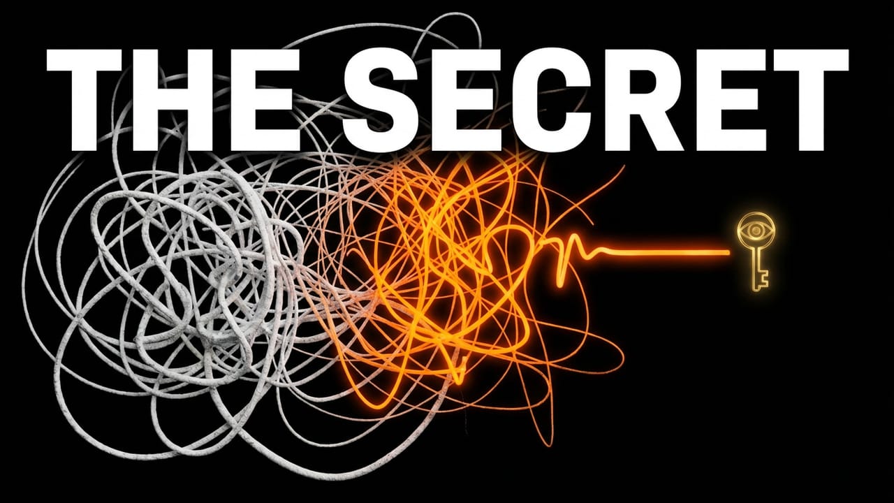
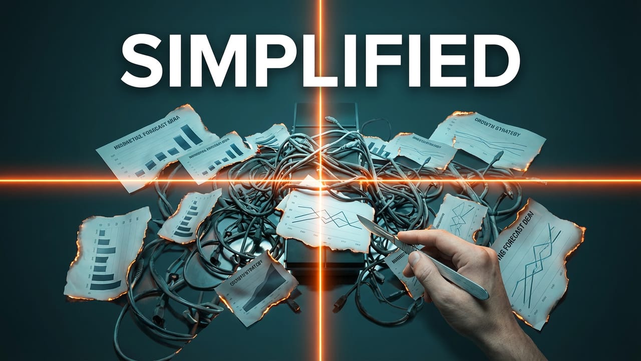
The five images:
Lab Discovery—a scientist peering at a glowing test tube

The Secret — tangled lines resolving into a golden key
Chaos to Clarity — an orange line cutting through a gray tangle

Simplified — tangled cables with burned reports and a crosshair
The Wrong Door — an exploding doorway with a silhouette
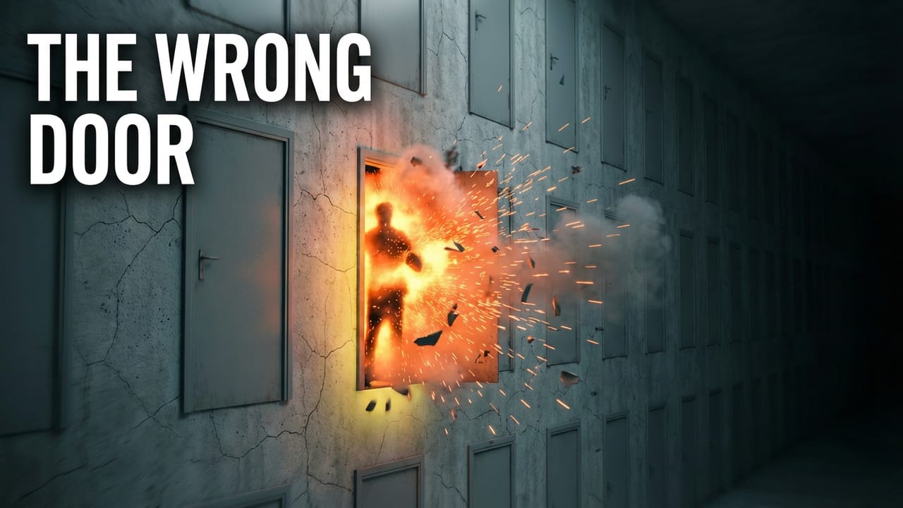


I was betting on The Wrong Door. Dramatic. Visceral. Felt like a scroll-stopper.
I was wrong.
THE WINNER
One image murdered the entire test. Literally…
Chaos to Clarity + H04
"What if you knew exactly why some months are packed and others are empty?"

An orange line cutting straight through a gray tangle. No text. No faces. No clever design. Just signal through noise.
17.14% CTR. Seven cents a click (!!!)
The next closest ad? 3.95%. That's not a win—that's a knockout.
5.6x the performance of every other image in the sprint.

One ad stands out while the rest compete for attention.
Your audience wants clarity, not drama or cleverness—they face daily chaos like messy pipelines and unpredictable revenue. A simple, clear image sparks recognition: "That’s what I need." The visual sells before any words are read. The best part? It was the simplest image—no text or editing, just a concept that matched how the audience feels and showed a way out.
$0.07 per click.
THE LOSER
The Wrong Door—the one I bet on—got 2.69% CTR with H09 but only 0.54% with H04.

Interesting to look at, but didn't connect to how founders actually feel. They don't feel like they're walking through an exploding door. They feel trapped in a tangle.
The Secret and Simplified barely got served. Meta killed them early. Too busy. Too much text. Too literal.
What the losers reveal: complexity loses. The more stuff in the image, the worse it performed.
THE UNEXPECTED SIGNAL
Same image. Different headline. 5.6x gap.
H04 + Chaos to Clarity: 17.14% CTR.
H09 + Chaos to Clarity: 3.03% CTR.
We almost went with H09 as the only headline for Sprint 4. If we had, Chaos to Clarity would have looked mediocre instead of being a breakout winner.
The combination matters more than the individual element. A winning image paired with the wrong headline still loses.
THE SIGNAL, DISTILLED
Four sprints. $47. Here's what the data actually says:
Your audience doesn't want clever. They want clear. They don't want frameworks — they want proof. They don't respond to drama — they respond to the feeling of "finally, someone gets it."
The simplest image beat the most dramatic one by 5.6x. The Case Study beat the Playbook by 3x. The specific pain beat the generic one by 2x.
If you're guessing your messaging, you're probably wrong about something. I was wrong about four things in four weeks. The difference is I spent $47 to find out instead of $4,700.
WHAT'S NEXT
Landing page: Chaos to Clarity image goes on founderscale.ceo/start. Scent matching with the winning ad.
H04 is locked. "What if you knew exactly why some months are packed and others are empty?" — on the landing page, in the ads, everywhere.
Sprint 5 (next week): Primary text — testing body copy above the locked image. One sprint away from the full conversion campaign.
Cold email: Testing the "What if you knew exactly why..." format in subject lines this week.
SEE YOU NEXT
YOUR MOVE
Still guessing who your best audience is? Stop.
We'll test it for you in 48 hours. Multiple ICPs, 13+ variants per audience, real data. You'll know exactly who responds to your offer—and who doesn't—before you spend another dollar on ads.
Or reply and tell me—if you had to pick between SaaS founders and consultants, which one would you have bet on? I'll tell you if you were right.
Thank you, see you soon!
